For the What's Your Truth fest for Jamie Ayres, I posted two truths and one lie. #1 was the lie - I've never been a competition ski racer. I have snorkeled with manta rays, green sea turtles, and sharks (from inside a cage with the sharks), and I have kayaked in the San Juan Islands with a visit from a pod of Orcas. And I'm really not that adventurous in every day life - just on vacation, in measured, planned amounts. :)
So, on late last Thursday night, I decided to change things up a bit here at my blog and try a new look. The picture of the dancers' feet is from a few years ago at a ballet studio my daughters danced with for a year. Of course, I captured a few mom feet in there too, because moms are a part of any dance studio.
So, what do you think? Is it too dark? Just right? Is the picture big enough or is it too small?
And today, a sonnet I wrote and submitted for the Write 1 Sub 1 Challenge this year, went live today at Bewildering Stories. Check out my "Robot Sonnet" (#1). I'm super excited to get back into the writing, submitting, and "hoping to be" published process of writing short works.
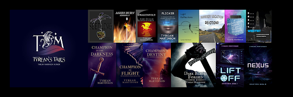
And yes, I'm working on Champion in Flight too.
What's up with you today? Did you guess the right truths?
Happy Writing and Happy Life!!!

22 comments:
I like the new look. I usually find dark backgrounds hard to read, but I'm not finding that here.
And congrats on the published sonnet! :)
I like the new header.
And score!!! I got the lie right.
Whether on vacation or everyday life, that sounds like some fun adventuring.
I like the new look. It has a calmness to it and the pic is adorable :-)
Three cheers for your sonnet!
I'm just a writing and a writing.
Madeline - thank you and thanks again!!! Glad it's not too hard to read.
Alex - thanks! And yes, you did!
Angela - Glad you like the new look! Best wishes with your writing!
Awesome new design. I like it.
Congrats on the sonnet. You're back in the trenches.
Ohhhh... I love anything ballet!!! (I was a ballet teacher for 14 years) Looove the picture.
And congrats, Tyrean---I love being in the zone. Keep working. Keep pushing. <3
I like the new look!! And the picture, it is really pretty.
You are adventurous on your holidays! It sounds like you have exciting ones
Natalie - Thanks!!!
Diane - Thank you! It feels great to get back into the "short" kind of writing.
Morgan - glad you like it!!! And thank you - it's good to back, getting mud on my face. :)
Jack - Thank you. I think it's pretty too. :) My adventures on the holidays are far between usually, but I relish them for years afterwards. :)
Nice! I also dislike super dark-backgrounds if there's white type on top. Yours is more medium-dark. You could feasibly go a shade or two lighter with the gray and it would still look nice. The palette does look very complimentary with your book cover. That unity is great.
Laurel - Thanks for the professional look at the site! I really appreciate it. I'll see if I can go a shade or two lighter.
Blog looks great! Easy on the eyes and well organized. Have fun with finishing your goals this month.
Wow, I love your sonnet. Congratulations!!
And I love the new look too, looks great and the header is perfect.
Robot Sonnet...that sounds EPIC. Yes! I totally guessed right. Go me! I guess hosting the truth or lie game for 9 months has taught me a thing or two about isolating the lie, eh?
I like the new look, including the header. And thank you for keeping the post area black on white. So much easier on the eyes.
you're such an adventurer! I like your changes - those dancers are adorable!!
and glad you're writing again! love bewildering stories!
happy hump day!
Heather - Thanks! I need to post those goals and my progress soon.
Crystal - Thanks! and Yes, Go You!!! I think hosting that kind of game could definitely help.
LD - Thanks! I find black on white a bit easier too.
Tara - Thank you!!! Happy hump day!
Julie - Wow! Thanks! (blushes)
I really like the photo. It's fantastic. Sorry I've been slow to get around over here. Glad you had a sonnet published. That's awesome news. Congrats!
M Pax - Thanks! And no probs - I've had a tough time finding time to blog and visit too.
Thanks again!
Loving the new blog look! It's definitely not too dark. In fact, I often find darker layouts easier on the eyes!
Sounds like you have awesome vacations. ^_^
I like the new look, although I think the picture needs a bit more brightening.
Post a Comment