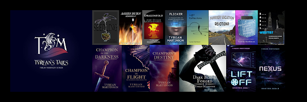

Insecure Writer's Support Group
Website / Facebook Group / Twitter / Book Club
Reedsy Discount / Past Issues
Purpose: To share and encourage. Writers can express doubts and concerns without fear of appearing foolish or weak. Those who have been through the fire can offer assistance and guidance. It’s a safe haven for insecure writers of all kinds!
Posting: The first Wednesday of every month is officially Insecure Writer’s Support Group day.
The awesome co-hosts for the February 7 posting of the IWSG are Janet Alcorn, SE White, Victoria Marie Lees, and Cathrina Constantine!
OPTIONAL February 7 question: What turns you off when visiting an author's website/blog? Lack of information? A drone of negativity? Little mention of author's books? Constant mention of books?
I'm going to turn that question upside down and re-ask: what do I like about visiting author's websites? What do I think works?
My answer: Clarity and authenticity.
I want to know who this author is, what they write, and a little bit about how they view the world, what they think/feel specifically about their writing and the writing life.
I enjoy fun memes, gifs, pictures, and slices of life, but the most important pieces I look for when I go search for an author online are usually to find their books and to discover their unique perspective.
I have been taking a class that recommends an extremely clear author website that makes it easy for readers to find books and to take a side jig over to an author page. I can see the benefit of that. I have always opted for "here I am," and "oh, over here are my books" kinds of blogs, websites, and such, but I may be recreating something that is easier to navigate from the front page.
What do you think?
What do you like to see on author websites?
I agree with you that an author's website should be clear. When I'm looking for authors to interview, I like there to be an easy way to find their bio page, a page about their books, and a page on how to contact them. Seeing pages about their events and resources for writers is a plus. I think you've done a good job of having clear tabs at the top of your website.
ReplyDeleteI've tried to keep my simple and easy to navigate. My website focuses a bit more on me as a speaker, but there is a page with my books.
ReplyDeleteSlice of life? Movie and music reviews count?
ReplyDeleteHi Tyrean - simple and clear is the best ... and as Diane mentions easy to navigate. It's good to have a clear mind ... which no doubt helps with other aspects needed by an author. Cheers Hilary
ReplyDeleteI like how you spun the question. I agree, it's better to get an idea of who the author is first, rather than just being hit with ads for books.
ReplyDeleteI always forget about 'slices of life.' I like that too! (I should do more of that.😁)
ReplyDeleteI agree! I also like something more simple and streamlined. Easy to read in terms of colors and fonts, not have a lot of hoopla and pop-ups, etc. My nearsighted, tired eyes appreciate that! :)
ReplyDeleteThe slice of life is always fun to read on an author's website/blog. I'm definitely guilty of overusing gifs...I just can't help myself. :)
ReplyDeleteNobody wants to spend time trying to figure out how to read and comment on a blog. So yes to well-organized and simple. What surprised me when I started reading blogs was that I could tell when someone was "reaching" for authentic and someone who was. Interesting.
ReplyDeleteTyrean, I am not sure what works! I like simple, in most cases, and if a site feels cluttered, I'll usually not spend much time on it. I've tried to make my site with this approach. It may be bland to some but it feels easy to navigate. I'll be adding things as needed but I want to keep it simple.
ReplyDeleteNatalie - going to check to see if I have a clear way of messaging me on here somewhere...
ReplyDeleteL. Diane - I like yours. It is clear and easy to navigate and tells us just enough about you. :)
Alex - yes and yes! :)
Hilary - clarity is always good, but I have a tendency to go random with my daydreaming...
Nick - agreed
HR - it is nice to see the author behind the magic curtain now and then, although mystery is good, too. :)
Madleine - I hadn't thought of colors and fonts. Hmm. Good ideas.
MJ - I love your gifs!
C.Lee - so true.
ib - I agree. I struggle with knowing what I need, but lately I've felt like my site is a bit cluttered.
ReplyDeleteI like some of the same things you look for in an author site.
ReplyDeleteI like your Link Tree. Been wondering if I need to update mine.
I agree that websites need to be clear and accessible. I don't like hunting for information. I'm not a fan of too much flashing or bright colours - I suffer with vertigo and some websites make me feel dizzy and nauseous, which is probably not what the author hopes for!
ReplyDelete