As the first Wednesday of the month, today is The Insecure Writer's Support Group Day blog hop, a monthly blog hop over a decade old started by Ninja Captain Alex J. Cavanaugh, Sci-fi Author and Great Encourager.
Each month, several volunteers step forward to help manage the hop, and this month, these intrepid writers and professional authors are: Jacqui Murray, Ronel Janse Van Vuuren, Pat Garcia, and Gwen Gardner!
Today's Optional Industry Question is: If you are an indie author, do you design your own book covers or have them professionally designed? If you are traditionally published, how much say do you have in your book cover design?
My answer straddles all the writing I've done.
COVER IMAGES FOR SHORT WORKS
As a traditionally published short story, poem, and article writer, I do not often have much, if any, choice in how my work is presented with images or cover designs.
Online publications attach specific images with short works to makes these works pop off the page and be more enticing to readers. However, I often have people assume these are my photos, and they usually are not. For example, I had a poem published at The Drabble called "Quest (ioning) Cat" and a photo of a tortoiseshell cat was attached to it. Readers assumed this was my cat, when actually my cat was a black and white American mix. However, I loved the image they chose, even if it wasn't "my" cat because honestly, once you send your work into the world, the reader's imagination or the editor's imagination fills in the blanks.
This is also true for larger anthologies, like The IWSG 2017 publication of their 2016 Anthology Contest Award Winners, Hero Lost: Mysteries of Death and Life, in which my short story "Of Words and Swords" was originally published professionally. I love the cover of the book and I think it suits the stories within it, even if I didn't design it. I think it's interesting and sometimes fun to see what other people's imaginations come up with for groups of stories.
The Champion Trilogy, Variations on a Theme
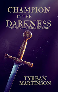
The following images show the way my first book covers changed over three different iterations. The first covers were created by my niece, a designer who has decided to work on designs for logos and events, instead of book covers. The two of us didn't really know how to work on book covers together, but her hand drawn images (not shown here) wowed me, and we attempted to figure out book cover design together. The very first cover she created was the one with the girl reaching for the sword, which I loved, but for some reason, we didn't know how to make the colors work with the uploads for Amazon and we kept getting different color variations from the same image, so we moved away from that to simpler color schemes for the trilogy.
After a while, I decided to try to recreate the covers on my own, using a combination of images purchased from Shutterstock and a Pro Canva account, which gives me a license to use certain images for professional designs I create on the account. The last three book covers (the current ones) are those.
Short Story E-book Covers
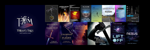
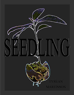
I created all of my short story Ebook book covers, because I meant from the start of creating them to use them as a "free" or inexpensive way to gather readers' interest for my work. In retrospect, I could have been a bit wiser about this process, but I like many of my covers, both old and new. This is just a sampling of short book variations. I have taken many off the market for now, although I am tempted to put them back up. Keeping them "permafree" on Amazon took too much fiddling with them on a regular basis and most of them need to have their back matter refinished, something I've fallen behind on. Seedling is still my most downloaded short title.
To create these, I used Microsoft Publisher and images I purchased or found free in free domain sites, although that made me nervous even when I cited them properly, so I have gone more and more to using images via Shutterstock or Canva Pro, which I have a license to use and have paid some $ for. In some instances, I have used my own photography, but that is rare. What is more common is for me to find an image, purchase the copyright, and manipulate it until it fits what I hope the cover is conveying.
Professionally Designed Covers
Working with a professional designer for cover design and interior design does take a great deal of the work load off of me in the creation of an Ebook or Paperback, and I've discovered in the process that I'm not always a good communicator of what I hope to do, which makes it really hard on the designer to work. If you are an Indie author, I suggest taking some serious time to study the current trends in book covers, then take the main elements of your book, think about how they would fit in the current trends, and then discuss this with your book designer.
I loved working with Carrie Butler, but I ignored some of her suggestions, and I think, well, I think these are lovely, but now, after much more study of cover designs, I think I could have gone a slightly different direction. I love the color scheme, and I love the lettering. I love so much about these covers. However, I missed the trend of putting people on the cover, something Carrie Butler suggested that I ignored. Considering these are YA novellas with a hint of romance in them, having at least one or two characters on each cover might have been wise. And yet, I still love them, which means I need to work on my own way of looking at my books in the future.
More Canva Designed Covers
Due to the fact that I haven't made a great deal of $ from my writing, I have to take cost into consideration for every cover and every aspect of each book. I know covers sell, but I also know how much I have to budget for each book, and I need to create covers which are both cost-effective and eye-catching. I have discovered that I enjoy creating covers, while, as I mentioned above, it's taken me a long while to discover what works, and what doesn't. Certain colors convey specific moods, tones, and storylines, as well as the age of readership.
These are my own latest designs, using purchased images, and the Canva Pro design tools:
Do they all work? Well, there are some I'm thinking of changing at some point in the future, but my understanding of cover design has slowly grown over the years, and I think I'm getting better at it. The amount of time and effort I put into each depends on the purpose of the design and how often/much use I plan to get out of it, whether it's for a series of posts, a short Ebook freebie or inexpensive "interest" title, or a lengthier book I hope to sell again and again.
You may notice a few Kindle Vella covers in this grouping, and there's a reason for that I will go into next Wednesday.
Do you create your own covers?


%20Final%209_21.jpg)
%20Final%209_21.jpg)


%20Final.jpg)


